Café com Hiperfoco
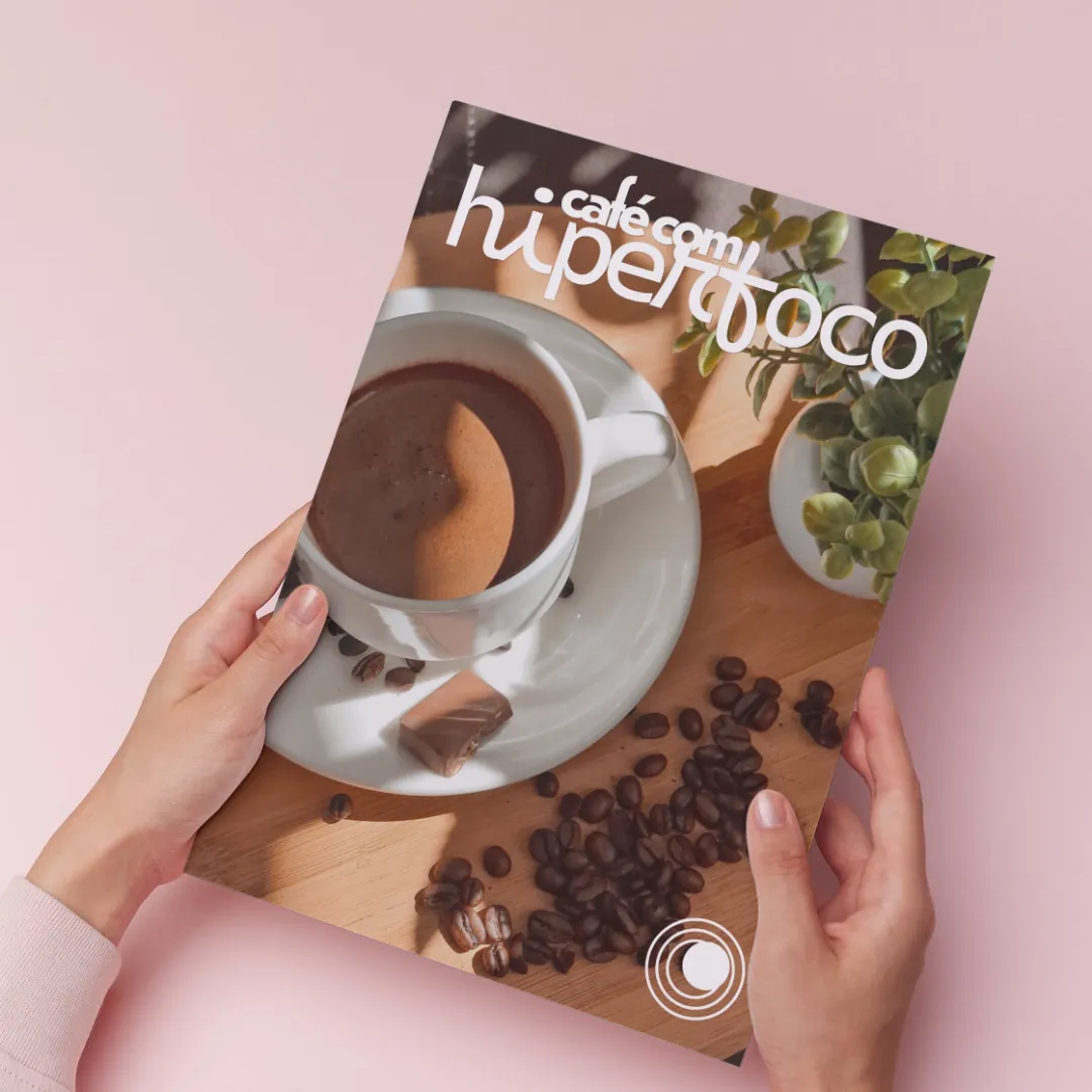
Café com Hiperfoco is a fictional publication focused on psychoeducation, featuring articles on mental health as well as coffee recipes and trivia. The project aimed to develop a visual identity for the publication and create a digital magazine.
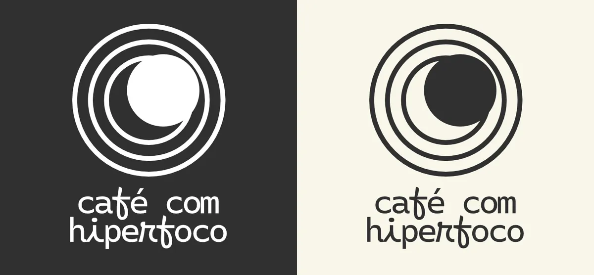
Logo
The logo was inspired by the concept of hyperfocus, a phenomenon frequently associated with neurodivergent conditions such as Attention Deficit Hyperactivity Disorder (ADHD) and Autism Spectrum Disorder (ASD).
The circles in the logo evoke the image of a target, often used to symbolize the ability to maintain focused attention, yet feature an off-center bullseye, indicating a divergence of focus, a characteristic trait of neurodivergent conditions.
Typography and colors
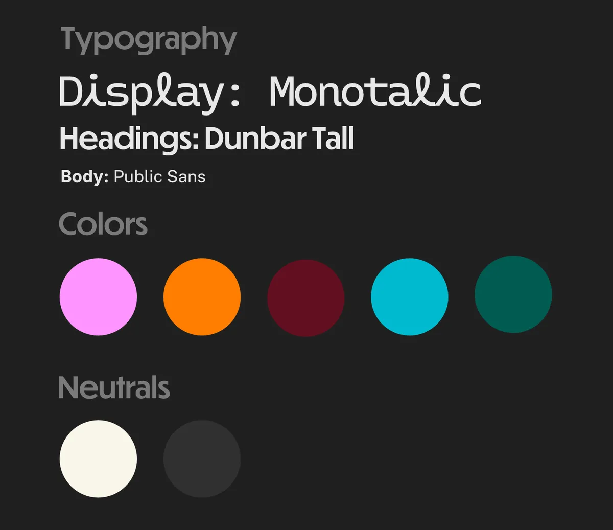
The typography was selected with the publication's digital format in mind, favoring sans-serif fonts known for high legibility, a key consideration given that the target audience may experience reading difficulties common to various forms of neurodivergence (particularly dyslexia).
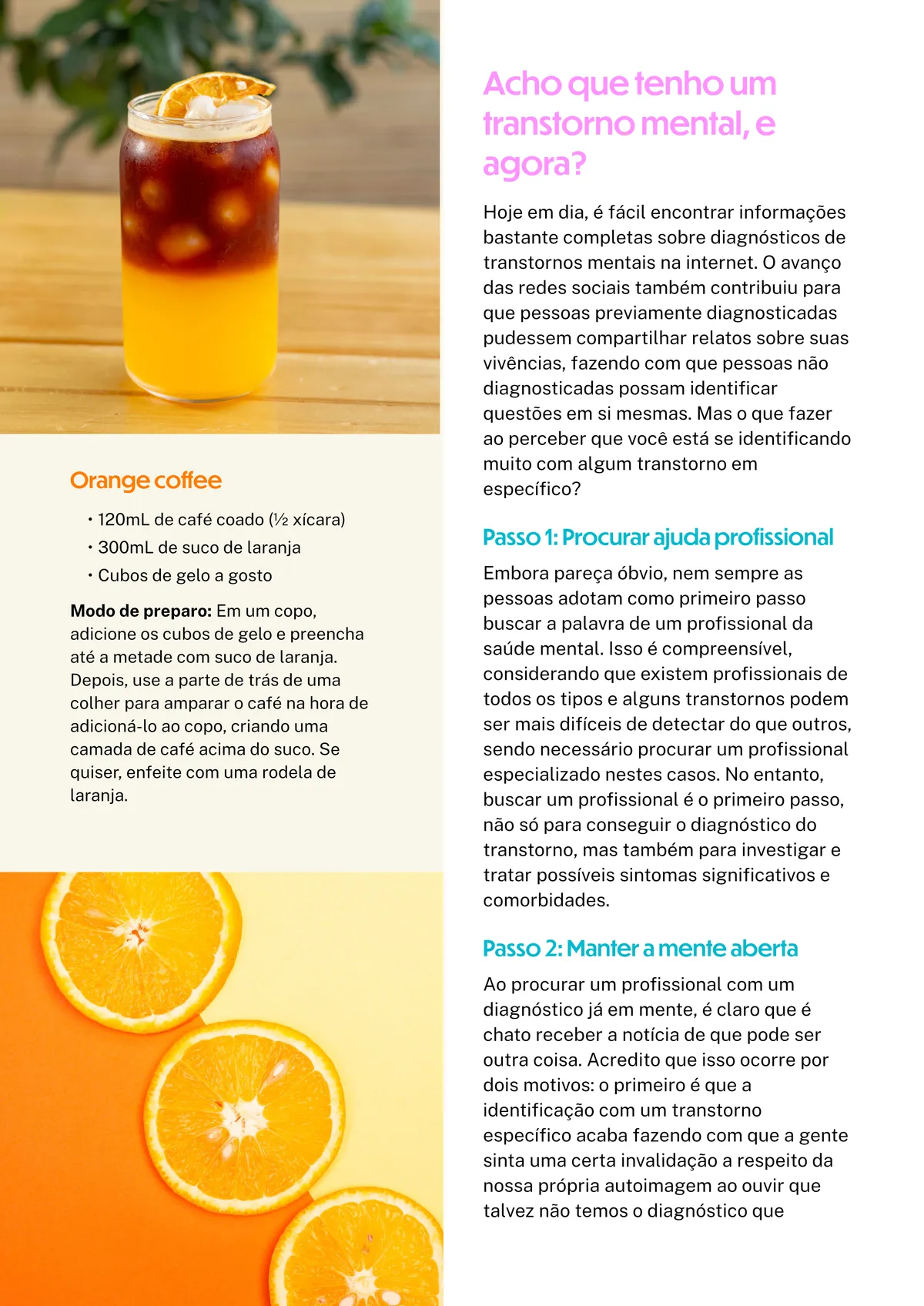
For this reason, the text avoids the justified alignment typical of print publications; variations in line length significantly impact readability for individuals with divergent sensory processing.
The color scheme draws inspiration from real-world coffee shop palettes (albeit non-traditional ones) reinforcing the concept of something that deviates from the norm.
Some pages of the project
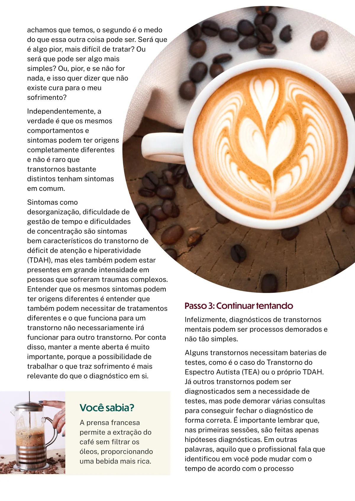
You can check the whole publication in .pdf format clicking here.